Creating an Instruction UI Screen in Flutter with source code – When designing a user-friendly instruction screen in a Flutter application, it’s essential to focus on clear communication, intuitive design, and seamless navigation. This guide will walk you through creating a well-structured Instruction UI Screen using Flutter and GetX while following best practices for UI/UX design.
1. Understanding the Instruction Screen
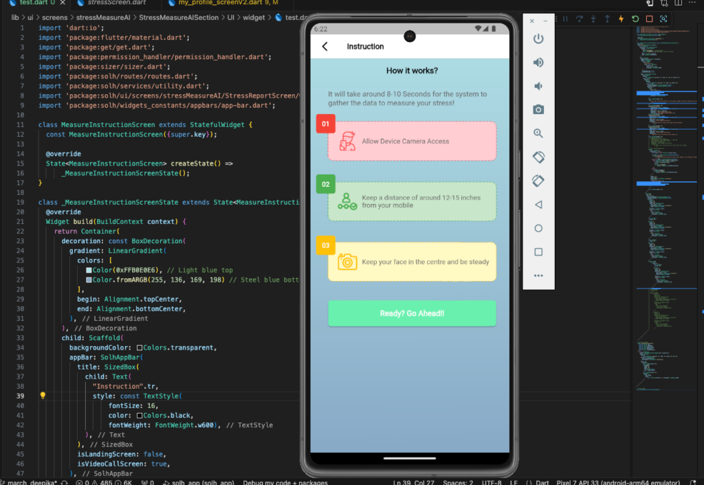
The Instruction UI Screen is designed to guide users through a process step-by-step before they proceed to the next screen. In this example, the instruction screen provides guidelines for using a stress measurement AI feature.
Key Features of the Screen:
✅ Gradient background for a modern look
✅ Stepwise instructions with icons and colors
✅ Permission handling for camera access
✅ A call-to-action button for user progression
2. Implementing the UI Screen in Flutter
2.1. Setting Up the Screen
The MeasureInstructionScreen class extends StatefulWidget to manage UI state. The background uses a LinearGradient to create a smooth transition from light blue to steel blue.
Container(
  decoration: const BoxDecoration(
    gradient: LinearGradient(
      colors: [Color(0xFFB0E0E6), Color.fromARGB(255, 136, 169, 198)],
      begin: Alignment.topCenter,
      end: Alignment.bottomCenter,
    ),
  ),
  child: Scaffold(
    backgroundColor: Colors.transparent,
    appBar: AppBar(
      title: Text(
        "Instruction",
        style: TextStyle(fontSize: 16, color: Colors.black, fontWeight: FontWeight.w600),
      ),
    ),
  ),
);
2.2. Adding Instruction Steps
Each instruction step is displayed using a custom instruction tile, providing:
✔ A step number
✔ A relevant icon
✔ A short description
Widget buildInstructionTile({
  required String step,
  required String imagePath,
  required String instruction,
  required Color bgborderColor,
  required Color borderColor,
  required Color cardborderColor,
}) {
  return CustomPaint(
    painter: DottedBorderPainterWidget(color: borderColor),
    child: Container(
      padding: const EdgeInsets.all(20),
      decoration: BoxDecoration(
        color: cardborderColor,
        borderRadius: BorderRadius.circular(10),
      ),
      child: Row(
        children: [
          Image.asset(imagePath, width: 40, height: 40, color: bgborderColor),
          const SizedBox(width: 10),
          Expanded(
            child: Text(instruction, style: TextStyle(fontSize: 14, fontWeight: FontWeight.w500)),
          ),
        ],
      ),
    ),
  );
}
🔹 Each step has a unique color for better differentiation:
- Step 1: Red (⚠️ Camera Access)
- Step 2: Green (📏 Maintain Distance)
- Step 3: Amber (📸 Keep Face Steady)
2.3. Handling Camera Permission
Before proceeding, users must allow camera access. The app handles permission requests using the permission_handler package.
final status = await Permission.camera.status;

if (status == PermissionStatus.permanentlyDenied) {
  Utility.showToast("Go to Settings to enable camera access.");
} else if (status != PermissionStatus.granted) {
  await Permission.camera.request().then((value) {
    if (value != PermissionStatus.granted) {
      Navigator.of(context).pop();
    } else {
      Navigator.pushNamed(context, AppRoutes.stressMeasureScreen);
    }
  });
} else {
  Navigator.pushNamed(context, AppRoutes.stressMeasureScreen);
}
2.4. Adding a Call-to-Action Button
A Green Button at the bottom prompts users to start the process.
GreenButton(
  onPressed: () {
    Navigator.pushNamed(context, AppRoutes.stressMeasureScreen);
  },
  height: 6.h,
  width: 100.w,
  borderRadius: BorderRadius.circular(6),
  child: Text(
    "Ready? Go Ahead!!",
    style: TextStyle(fontSize: 16, fontWeight: FontWeight.w600, color: Colors.white),
  ),
);
Complete Code
import 'dart:io';
import 'package:flutter/material.dart';
import 'package:get/get.dart';
import 'package:permission_handler/permission_handler.dart';
import 'package:sizer/sizer.dart';
import 'package:filename/routes/routes.dart';
import 'package:filename/services/utility.dart';
import 'package:filename/ui/screens/stressMeasureAI/StressReportScreen/widget/dottedborderWidget.dart';
import 'package:filename/widgets_constants/appbars/app-bar.dart';
class MeasureInstructionScreen extends StatefulWidget {
const MeasureInstructionScreen({super.key});
@override
State<MeasureInstructionScreen> createState() =>
_MeasureInstructionScreenState();
}
class _MeasureInstructionScreenState extends State<MeasureInstructionScreen> {
@override
Widget build(BuildContext context) {
return Container(
decoration: const BoxDecoration(
gradient: LinearGradient(
colors: [
Color(0xFFB0E0E6), // Light blue top
Color.fromARGB(255, 136, 169, 198) // Steel blue bottom
],
begin: Alignment.topCenter,
end: Alignment.bottomCenter,
),
),
child: Scaffold(
backgroundColor: Colors.transparent,
appBar: AppBar(
title: SizedBox(
child: Text(
"Instruction",
style: const TextStyle(
fontSize: 16,
color: Colors.black,
fontWeight: FontWeight.w600),
),
),
isLandingScreen: false,
isVideoCallScreen: true,
),
body: SingleChildScrollView(
child: Padding(
padding:
const EdgeInsets.only(left: 12, right: 12, top: 15, bottom: 15),
child: Stack(
children: [
Padding(
padding:
const EdgeInsets.only(left: 25, right: 15, bottom: 10),
child: Column(
crossAxisAlignment: CrossAxisAlignment.center,
mainAxisAlignment: MainAxisAlignment.center,
children: [
Center(
child: Text(
"How it works?".tr,
style: const TextStyle(
color: Colors.black,
fontSize: 17,
fontWeight: FontWeight.w600),
textAlign: TextAlign.center,
),
),
const SizedBox(height: 30),
Text(
"It will take around 8-10 Seconds for the system to gather the data to measure your stress!"
.tr,
style: TextStyle(fontSize: 15),
),
const SizedBox(height: 30),
buildInstructionTile(
bgborderColor: Colors.redAccent,
cardborderColor: Color(0xFFFFCDD2), // Light red
step: "01",
borderColor: Colors.redAccent,
imagePath: 'assets/images/stress2.png',
instruction: "Allow Device Camera Access".tr),
const SizedBox(height: 45),
buildInstructionTile(
bgborderColor: Colors.green,
cardborderColor: Color(0xFFC8E6C9), // Light green
step: "02",
borderColor: Colors.green,
imagePath: 'assets/images/stress4.png',
instruction:
"Keep a distance of around 12-15 inches from your mobile"
.tr,
),
const SizedBox(height: 45),
buildInstructionTile(
bgborderColor: Colors.amber,
cardborderColor: Color(0xFFFFF9C4), // Light yellow
step: "03",
borderColor: Colors.amber,
imagePath: 'assets/images/stress1.png',
instruction:
"Keep your face in the centre and be steady".tr,
),
const SizedBox(height: 40),
Center(
child: GreenButton(
onPressed: () async {
final status = await Permission.camera.status;
if (status == PermissionStatus.permanentlyDenied) {
Utility.showToast(
"User has previously denied the camera access request. Go to Settings to enable camera access."
.tr);
} else if (status != PermissionStatus.granted) {
await Permission.camera.request().then((value) {
if (value != PermissionStatus.granted) {
Navigator.of(context).pop();
} else {
Navigator.pushNamed(
context, AppRoutes.stressMeasureScreen);
}
});
} else {
if (context.mounted) {
Navigator.pushNamed(
context, AppRoutes.stressMeasureScreen);
}
}
},
height: 6.h,
width: 100.w,
borderRadius: BorderRadius.circular(6),
child: Text(
"Ready? Go Ahead!!".tr,
style: TextStyle(
fontSize: 16,
fontWeight: FontWeight.w600,
color: Colors.white),
),
),
),
const SizedBox(height: 20),
],
),
),
Positioned(
top: 100,
child: Column(
mainAxisAlignment: MainAxisAlignment.start,
crossAxisAlignment: CrossAxisAlignment.start,
children: [
Container(
width: 40,
height: 40,
decoration: BoxDecoration(
color: Colors.red,
borderRadius: BorderRadius.circular(5),
shape: BoxShape.rectangle,
),
alignment: Alignment.center,
child: const Text(
"01",
style: TextStyle(
color: Colors.white,
fontWeight: FontWeight.bold,
),
),
),
const SizedBox(
height: 85,
),
Container(
width: 40,
height: 40,
decoration: BoxDecoration(
color: Colors.green,
borderRadius: BorderRadius.circular(5),
shape: BoxShape.rectangle,
),
alignment: Alignment.center,
child: const Text(
"02",
style: TextStyle(
color: Colors.white,
fontWeight: FontWeight.bold,
),
),
),
const SizedBox(
height: 87,
),
Container(
width: 40,
height: 40,
decoration: BoxDecoration(
color: Colors.amber,
borderRadius: BorderRadius.circular(5),
shape: BoxShape.rectangle,
),
alignment: Alignment.center,
child: const Text(
"03",
style: TextStyle(
color: Colors.white,
fontWeight: FontWeight.bold,
),
),
),
Platform.isIOS
? Column(
children: [
const SizedBox(
height: 80,
),
Container(
width: 40,
height: 40,
decoration: BoxDecoration(
color: Colors.red,
borderRadius: BorderRadius.circular(5),
shape: BoxShape.rectangle,
),
alignment: Alignment.center,
child: const Text(
"04",
style: TextStyle(
color: Colors.white,
fontWeight: FontWeight.bold,
),
),
),
],
)
: SizedBox.shrink(),
],
),
),
],
),
),
),
),
);
}
// instruction widget
Widget buildInstructionTile({
required String step,
required String imagePath,
required String instruction,
required Color bgborderColor,
required Color borderColor,
required Color cardborderColor,
}) {
return CustomPaint(
painter: DottedBorderPainterWidget(color: borderColor),
child: Container(
padding:
const EdgeInsets.only(left: 10, right: 10, bottom: 20, top: 20),
decoration: BoxDecoration(
color: cardborderColor,
borderRadius: BorderRadius.circular(10),
),
child: Row(
children: [
const SizedBox(width: 10),
Image.asset(
imagePath,
width: 40,
height: 40,
fit: BoxFit.contain,
color: bgborderColor,
),
const SizedBox(width: 10),
Expanded(
child: Text(
instruction,
style:
const TextStyle(fontSize: 14, fontWeight: FontWeight.w500),
),
),
],
),
),
);
}
}
// button widget
class GreenButton extends StatelessWidget {
const GreenButton({
super.key,
required this.child,
this.onPressed,
this.height,
this.width,
this.backgroundColor,
this.padding,
this.border,
this.borderRadius,
this.alignment,
this.margin,
});
final double? height;
final double? width;
final Widget child;
final Color? backgroundColor;
final VoidCallback? onPressed;
final EdgeInsets? padding;
final Border? border;
final BorderRadius? borderRadius;
final Alignment? alignment;
final EdgeInsets? margin;
@override
Widget build(BuildContext context) {
return ElevatedButton(
style: ButtonStyle(
backgroundColor:
MaterialStateProperty.all(backgroundColor ?? Colors.greenAccent),
shape: MaterialStateProperty.all<RoundedRectangleBorder>(
RoundedRectangleBorder(
borderRadius: borderRadius ?? BorderRadius.circular(30.0),
)),
// side: MaterialStateProperty.all<BorderSide>(
// BorderSide(
// color: backgroundColor ??
// SolhColors.primary_green), // Adjust border color here
// ),
),
onPressed: onPressed,
child: Container(
height: height ?? 7.h,
width: width ?? 180,
padding: const EdgeInsets.all(1),
child: Center(child: child),
),
);
}
}
3. Enhancing UI/UX for Better User Experience
- Use Animations 🎞: Apply simple animations for better engagement.
- Provide Feedback 🔔: Show a loading indicator when checking permissions.
- Optimize for Accessibility ♿: Ensure the text is readable with good contrast.
Conclusion
Creating an Instruction UI Screen in Flutter involves designing a clear, stepwise guide that is easy to follow. By implementing visually appealing UI elements, permission handling, and a call-to-action button, we ensure an intuitive user experience.
🚀 Now you’re ready to build an instruction screen for any Flutter app! 🎯
Related Articles
- How to make Ludo app in Flutter with Source Code Step by step
- How to make PDF Reader app in Flutter with Source Code Step by step
- How to make QR Scanner app in Flutter with Source Code Step by step
- How to Make a ToDo App with Flutter with source Code StepWise in 2024
- What is package in Flutter (Dart) with example in 2024
- What is class in Flutter(Dart) with example step by step
- Advantage of Flutter with examples in 2024
- Top 15 Amazing Applications Built with Flutter Framework
- Implementing a Dynamic FAQ Screen UI in Flutter Using ExpansionTile


0 Comments