A clean, professional login and registration screen is the gateway to every great app. First impressions matter — and a well-designed authentication UI builds instant trust with your users.
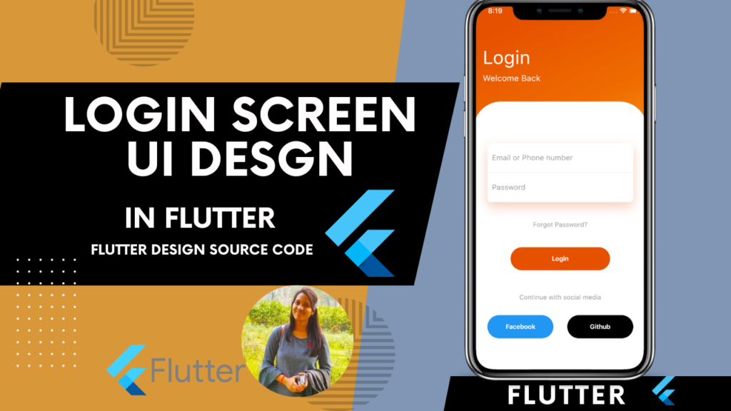
In this guide, we build a complete Flutter Login and Registration UI from scratch — with professional design, form validation, smooth navigation, and full source code ready to drop into any project.
What We Are Building
A professional authentication flow featuring:
- Splash-to-Login navigation
- Professional Login Screen with email and password
- Registration Screen with full form fields
- Form validation on all inputs
- Password show and hide toggle
- Smooth page navigation between Login and Register
- Clean dark-themed professional UI
- Reusable custom widgets

Project Structure
lib/
├── main.dart
├── screens/
│   ├── login_screen.dart
│   └── register_screen.dart
├── widgets/
│   ├── custom_text_field.dart
│   └── custom_button.dart
└── utils/
    └── validators.dart
Step 1: main.dart
import 'package:flutter/material.dart';
import 'screens/login_screen.dart';

void main() {
  runApp(const MyApp());
}

class MyApp extends StatelessWidget {
  const MyApp({super.key});

  @override
  Widget build(BuildContext context) {
    return MaterialApp(
      title: 'Flutter Auth UI',
      debugShowCheckedModeBanner: false,
      theme: ThemeData(
        useMaterial3: true,
        fontFamily: 'Poppins',
        colorScheme: ColorScheme.fromSeed(
          seedColor: const Color(0xFF6C63FF),
          brightness: Brightness.dark,
        ),
      ),
      home: const LoginScreen(),
    );
  }
}
Step 2: Custom Text Field Widget
Create lib/widgets/custom_text_field.dart:
import 'package:flutter/material.dart';

class CustomTextField extends StatefulWidget {
  final String label;
  final String hint;
  final IconData prefixIcon;
  final bool isPassword;
  final TextEditingController controller;
  final String? Function(String?)? validator;
  final TextInputType keyboardType;

  const CustomTextField({
    super.key,
    required this.label,
    required this.hint,
    required this.prefixIcon,
    required this.controller,
    this.isPassword = false,
    this.validator,
    this.keyboardType = TextInputType.text,
  });

  @override
  State<CustomTextField> createState() => _CustomTextFieldState();
}

class _CustomTextFieldState extends State<CustomTextField> {
  bool _obscureText = true;

  @override
  Widget build(BuildContext context) {
    return Column(
      crossAxisAlignment: CrossAxisAlignment.start,
      children: [
        Text(
          widget.label,
          style: const TextStyle(
            fontSize: 13,
            fontWeight: FontWeight.w600,
            color: Colors.white70,
            letterSpacing: 0.5,
          ),
        ),
        const SizedBox(height: 8),
        TextFormField(
          controller: widget.controller,
          obscureText: widget.isPassword ? _obscureText : false,
          keyboardType: widget.keyboardType,
          validator: widget.validator,
          style: const TextStyle(
            color: Colors.white,
            fontSize: 15,
          ),
          decoration: InputDecoration(
            hintText: widget.hint,
            hintStyle: TextStyle(
              color: Colors.white.withOpacity(0.3),
              fontSize: 14,
            ),
            prefixIcon: Icon(
              widget.prefixIcon,
              color: const Color(0xFF6C63FF),
              size: 20,
            ),
            suffixIcon: widget.isPassword
                ? IconButton(
                    icon: Icon(
                      _obscureText
                          ? Icons.visibility_off_rounded
                          : Icons.visibility_rounded,
                      color: Colors.white38,
                      size: 20,
                    ),
                    onPressed: () {
                      setState(() {
                        _obscureText = !_obscureText;
                      });
                    },
                  )
                : null,
            filled: true,
            fillColor: const Color(0xFF1E1E2E),
            border: OutlineInputBorder(
              borderRadius: BorderRadius.circular(14),
              borderSide: BorderSide.none,
            ),
            enabledBorder: OutlineInputBorder(
              borderRadius: BorderRadius.circular(14),
              borderSide: BorderSide(
                color: Colors.white.withOpacity(0.08),
                width: 1,
              ),
            ),
            focusedBorder: OutlineInputBorder(
              borderRadius: BorderRadius.circular(14),
              borderSide: const BorderSide(
                color: Color(0xFF6C63FF),
                width: 1.5,
              ),
            ),
            errorBorder: OutlineInputBorder(
              borderRadius: BorderRadius.circular(14),
              borderSide: const BorderSide(
                color: Colors.redAccent,
                width: 1,
              ),
            ),
            focusedErrorBorder: OutlineInputBorder(
              borderRadius: BorderRadius.circular(14),
              borderSide: const BorderSide(
                color: Colors.redAccent,
                width: 1.5,
              ),
            ),
            errorStyle: const TextStyle(
              color: Colors.redAccent,
              fontSize: 12,
            ),
            contentPadding: const EdgeInsets.symmetric(
              horizontal: 16,
              vertical: 16,
            ),
          ),
        ),
      ],
    );
  }
}
Step 3: Custom Button Widget
Create lib/widgets/custom_button.dart:
import 'package:flutter/material.dart';

class CustomButton extends StatelessWidget {
  final String text;
  final VoidCallback onPressed;
  final bool isLoading;
  final Color? backgroundColor;
  final Color? textColor;
  final double? width;

  const CustomButton({
    super.key,
    required this.text,
    required this.onPressed,
    this.isLoading = false,
    this.backgroundColor,
    this.textColor,
    this.width,
  });

  @override
  Widget build(BuildContext context) {
    return SizedBox(
      width: width ?? double.infinity,
      height: 56,
      child: ElevatedButton(
        onPressed: isLoading ? null : onPressed,
        style: ElevatedButton.styleFrom(
          backgroundColor: backgroundColor ?? const Color(0xFF6C63FF),
          foregroundColor: textColor ?? Colors.white,
          disabledBackgroundColor: const Color(0xFF6C63FF).withOpacity(0.6),
          elevation: 0,
          shape: RoundedRectangleBorder(
            borderRadius: BorderRadius.circular(16),
          ),
        ),
        child: isLoading
            ? const SizedBox(
                width: 22,
                height: 22,
                child: CircularProgressIndicator(
                  strokeWidth: 2.5,
                  valueColor: AlwaysStoppedAnimation<Color>(Colors.white),
                ),
              )
            : Text(
                text,
                style: const TextStyle(
                  fontSize: 16,
                  fontWeight: FontWeight.w600,
                  letterSpacing: 0.5,
                ),
              ),
      ),
    );
  }
}
Step 4: Validators
Create lib/utils/validators.dart:
class Validators {
  static String? validateEmail(String? value) {
    if (value == null || value.isEmpty) {
      return 'Email is required';
    }
    final emailRegex = RegExp(
      r'^[a-zA-Z0-9._%+-]+@[a-zA-Z0-9.-]+\.[a-zA-Z]{2,}$',
    );
    if (!emailRegex.hasMatch(value)) {
      return 'Enter a valid email address';
    }
    return null;
  }

  static String? validatePassword(String? value) {
    if (value == null || value.isEmpty) {
      return 'Password is required';
    }
    if (value.length < 8) {
      return 'Password must be at least 8 characters';
    }
    if (!value.contains(RegExp(r'[A-Z]'))) {
      return 'Password must contain at least one uppercase letter';
    }
    if (!value.contains(RegExp(r'[0-9]'))) {
      return 'Password must contain at least one number';
    }
    return null;
  }

  static String? validateName(String? value) {
    if (value == null || value.isEmpty) {
      return 'Full name is required';
    }
    if (value.length < 3) {
      return 'Name must be at least 3 characters';
    }
    return null;
  }

  static String? validatePhone(String? value) {
    if (value == null || value.isEmpty) {
      return 'Phone number is required';
    }
    if (value.length < 10) {
      return 'Enter a valid phone number';
    }
    return null;
  }

  static String? validateConfirmPassword(String? value, String password) {
    if (value == null || value.isEmpty) {
      return 'Please confirm your password';
    }
    if (value != password) {
      return 'Passwords do not match';
    }
    return null;
  }
}
Step 5: Login Screen
Create lib/screens/login_screen.dart:
import 'package:flutter/material.dart';
import '../widgets/custom_text_field.dart';
import '../widgets/custom_button.dart';
import '../utils/validators.dart';
import 'register_screen.dart';

class LoginScreen extends StatefulWidget {
  const LoginScreen({super.key});

  @override
  State<LoginScreen> createState() => _LoginScreenState();
}

class _LoginScreenState extends State<LoginScreen> {
  final _formKey = GlobalKey<FormState>();
  final _emailController = TextEditingController();
  final _passwordController = TextEditingController();
  bool _isLoading = false;

  @override
  void dispose() {
    _emailController.dispose();
    _passwordController.dispose();
    super.dispose();
  }

  void _handleLogin() async {
    if (_formKey.currentState!.validate()) {
      setState(() => _isLoading = true);
      await Future.delayed(const Duration(seconds: 2));
      setState(() => _isLoading = false);
      if (mounted) {
        ScaffoldMessenger.of(context).showSnackBar(
          SnackBar(
            content: const Text('Login Successful!'),
            backgroundColor: const Color(0xFF6C63FF),
            behavior: SnackBarBehavior.floating,
            shape: RoundedRectangleBorder(
              borderRadius: BorderRadius.circular(12),
            ),
          ),
        );
      }
    }
  }

  @override
  Widget build(BuildContext context) {
    return Scaffold(
      backgroundColor: const Color(0xFF0D0D1A),
      body: SafeArea(
        child: SingleChildScrollView(
          padding: const EdgeInsets.symmetric(horizontal: 24),
          child: Form(
            key: _formKey,
            child: Column(
              crossAxisAlignment: CrossAxisAlignment.start,
              children: [
                const SizedBox(height: 48),
                _buildHeader(),
                const SizedBox(height: 48),
                _buildSocialLogin(),
                const SizedBox(height: 32),
                _buildDivider(),
                const SizedBox(height: 32),
                CustomTextField(
                  label: 'Email Address',
                  hint: 'Enter your email',
                  prefixIcon: Icons.email_outlined,
                  controller: _emailController,
                  keyboardType: TextInputType.emailAddress,
                  validator: Validators.validateEmail,
                ),
                const SizedBox(height: 20),
                CustomTextField(
                  label: 'Password',
                  hint: 'Enter your password',
                  prefixIcon: Icons.lock_outline_rounded,
                  controller: _passwordController,
                  isPassword: true,
                  validator: Validators.validatePassword,
                ),
                const SizedBox(height: 12),
                _buildForgotPassword(),
                const SizedBox(height: 32),
                CustomButton(
                  text: 'Sign In',
                  onPressed: _handleLogin,
                  isLoading: _isLoading,
                ),
                const SizedBox(height: 32),
                _buildRegisterLink(),
                const SizedBox(height: 32),
              ],
            ),
          ),
        ),
      ),
    );
  }

  Widget _buildHeader() {
    return Column(
      crossAxisAlignment: CrossAxisAlignment.start,
      children: [
        Container(
          width: 56,
          height: 56,
          decoration: BoxDecoration(
            color: const Color(0xFF6C63FF).withOpacity(0.15),
            borderRadius: BorderRadius.circular(16),
            border: Border.all(
              color: const Color(0xFF6C63FF).withOpacity(0.3),
              width: 1,
            ),
          ),
          child: const Icon(
            Icons.rocket_launch_rounded,
            color: Color(0xFF6C63FF),
            size: 28,
          ),
        ),
        const SizedBox(height: 24),
        const Text(
          'Welcome Back!',
          style: TextStyle(
            fontSize: 32,
            fontWeight: FontWeight.bold,
            color: Colors.white,
            letterSpacing: -0.5,
          ),
        ),
        const SizedBox(height: 8),
        Text(
          'Sign in to continue to your account',
          style: TextStyle(
            fontSize: 15,
            color: Colors.white.withOpacity(0.5),
          ),
        ),
      ],
    );
  }

  Widget _buildSocialLogin() {
    return Row(
      children: [
        Expanded(
          child: _SocialButton(
            icon: Icons.g_mobiledata_rounded,
            label: 'Google',
            onTap: () {},
          ),
        ),
        const SizedBox(width: 16),
        Expanded(
          child: _SocialButton(
            icon: Icons.apple_rounded,
            label: 'Apple',
            onTap: () {},
          ),
        ),
      ],
    );
  }

  Widget _buildDivider() {
    return Row(
      children: [
        Expanded(
          child: Divider(
            color: Colors.white.withOpacity(0.1),
            thickness: 1,
          ),
        ),
        Padding(
          padding: const EdgeInsets.symmetric(horizontal: 16),
          child: Text(
            'or continue with email',
            style: TextStyle(
              fontSize: 12,
              color: Colors.white.withOpacity(0.4),
            ),
          ),
        ),
        Expanded(
          child: Divider(
            color: Colors.white.withOpacity(0.1),
            thickness: 1,
          ),
        ),
      ],
    );
  }

  Widget _buildForgotPassword() {
    return Align(
      alignment: Alignment.centerRight,
      child: TextButton(
        onPressed: () {},
        style: TextButton.styleFrom(
          padding: EdgeInsets.zero,
          minimumSize: Size.zero,
          tapTargetSize: MaterialTapTargetSize.shrinkWrap,
        ),
        child: const Text(
          'Forgot Password?',
          style: TextStyle(
            fontSize: 13,
            color: Color(0xFF6C63FF),
            fontWeight: FontWeight.w600,
          ),
        ),
      ),
    );
  }

  Widget _buildRegisterLink() {
    return Row(
      mainAxisAlignment: MainAxisAlignment.center,
      children: [
        Text(
          "Don't have an account? ",
          style: TextStyle(
            fontSize: 14,
            color: Colors.white.withOpacity(0.5),
          ),
        ),
        GestureDetector(
          onTap: () {
            Navigator.push(
              context,
              MaterialPageRoute(
                builder: (context) => const RegisterScreen(),
              ),
            );
          },
          child: const Text(
            'Sign Up',
            style: TextStyle(
              fontSize: 14,
              color: Color(0xFF6C63FF),
              fontWeight: FontWeight.w700,
            ),
          ),
        ),
      ],
    );
  }
}

class _SocialButton extends StatelessWidget {
  final IconData icon;
  final String label;
  final VoidCallback onTap;

  const _SocialButton({
    required this.icon,
    required this.label,
    required this.onTap,
  });

  @override
  Widget build(BuildContext context) {
    return GestureDetector(
      onTap: onTap,
      child: Container(
        height: 52,
        decoration: BoxDecoration(
          color: const Color(0xFF1E1E2E),
          borderRadius: BorderRadius.circular(14),
          border: Border.all(
            color: Colors.white.withOpacity(0.08),
            width: 1,
          ),
        ),
        child: Row(
          mainAxisAlignment: MainAxisAlignment.center,
          children: [
            Icon(icon, color: Colors.white, size: 22),
            const SizedBox(width: 8),
            Text(
              label,
              style: const TextStyle(
                fontSize: 14,
                color: Colors.white,
                fontWeight: FontWeight.w500,
              ),
            ),
          ],
        ),
      ),
    );
  }
}
Step 6: Registration Screen
Create lib/screens/register_screen.dart:
import 'package:flutter/material.dart';
import '../widgets/custom_text_field.dart';
import '../widgets/custom_button.dart';
import '../utils/validators.dart';

class RegisterScreen extends StatefulWidget {
  const RegisterScreen({super.key});

  @override
  State<RegisterScreen> createState() => _RegisterScreenState();
}

class _RegisterScreenState extends State<RegisterScreen> {
  final _formKey = GlobalKey<FormState>();
  final _nameController = TextEditingController();
  final _emailController = TextEditingController();
  final _phoneController = TextEditingController();
  final _passwordController = TextEditingController();
  final _confirmPasswordController = TextEditingController();
  bool _isLoading = false;
  bool _agreeToTerms = false;

  @override
  void dispose() {
    _nameController.dispose();
    _emailController.dispose();
    _phoneController.dispose();
    _passwordController.dispose();
    _confirmPasswordController.dispose();
    super.dispose();
  }

  void _handleRegister() async {
    if (!_agreeToTerms) {
      ScaffoldMessenger.of(context).showSnackBar(
        SnackBar(
          content: const Text('Please agree to Terms & Conditions'),
          backgroundColor: Colors.redAccent,
          behavior: SnackBarBehavior.floating,
          shape: RoundedRectangleBorder(
            borderRadius: BorderRadius.circular(12),
          ),
        ),
      );
      return;
    }
    if (_formKey.currentState!.validate()) {
      setState(() => _isLoading = true);
      await Future.delayed(const Duration(seconds: 2));
      setState(() => _isLoading = false);
      if (mounted) {
        ScaffoldMessenger.of(context).showSnackBar(
          SnackBar(
            content: const Text('Account Created Successfully!'),
            backgroundColor: const Color(0xFF6C63FF),
            behavior: SnackBarBehavior.floating,
            shape: RoundedRectangleBorder(
              borderRadius: BorderRadius.circular(12),
            ),
          ),
        );
        Navigator.pop(context);
      }
    }
  }

  @override
  Widget build(BuildContext context) {
    return Scaffold(
      backgroundColor: const Color(0xFF0D0D1A),
      body: SafeArea(
        child: SingleChildScrollView(
          padding: const EdgeInsets.symmetric(horizontal: 24),
          child: Form(
            key: _formKey,
            child: Column(
              crossAxisAlignment: CrossAxisAlignment.start,
              children: [
                const SizedBox(height: 24),
                _buildBackButton(context),
                const SizedBox(height: 24),
                _buildHeader(),
                const SizedBox(height: 36),
                CustomTextField(
                  label: 'Full Name',
                  hint: 'Enter your full name',
                  prefixIcon: Icons.person_outline_rounded,
                  controller: _nameController,
                  validator: Validators.validateName,
                ),
                const SizedBox(height: 20),
                CustomTextField(
                  label: 'Email Address',
                  hint: 'Enter your email',
                  prefixIcon: Icons.email_outlined,
                  controller: _emailController,
                  keyboardType: TextInputType.emailAddress,
                  validator: Validators.validateEmail,
                ),
                const SizedBox(height: 20),
                CustomTextField(
                  label: 'Phone Number',
                  hint: 'Enter your phone number',
                  prefixIcon: Icons.phone_outlined,
                  controller: _phoneController,
                  keyboardType: TextInputType.phone,
                  validator: Validators.validatePhone,
                ),
                const SizedBox(height: 20),
                CustomTextField(
                  label: 'Password',
                  hint: 'Create a strong password',
                  prefixIcon: Icons.lock_outline_rounded,
                  controller: _passwordController,
                  isPassword: true,
                  validator: Validators.validatePassword,
                ),
                const SizedBox(height: 20),
                CustomTextField(
                  label: 'Confirm Password',
                  hint: 'Re-enter your password',
                  prefixIcon: Icons.lock_outline_rounded,
                  controller: _confirmPasswordController,
                  isPassword: true,
                  validator: (value) => Validators.validateConfirmPassword(
                    value,
                    _passwordController.text,
                  ),
                ),
                const SizedBox(height: 24),
                _buildTermsCheckbox(),
                const SizedBox(height: 32),
                CustomButton(
                  text: 'Create Account',
                  onPressed: _handleRegister,
                  isLoading: _isLoading,
                ),
                const SizedBox(height: 24),
                _buildLoginLink(),
                const SizedBox(height: 32),
              ],
            ),
          ),
        ),
      ),
    );
  }

  Widget _buildBackButton(BuildContext context) {
    return GestureDetector(
      onTap: () => Navigator.pop(context),
      child: Container(
        width: 44,
        height: 44,
        decoration: BoxDecoration(
          color: const Color(0xFF1E1E2E),
          borderRadius: BorderRadius.circular(12),
          border: Border.all(
            color: Colors.white.withOpacity(0.08),
            width: 1,
          ),
        ),
        child: const Icon(
          Icons.arrow_back_rounded,
          color: Colors.white,
          size: 20,
        ),
      ),
    );
  }

  Widget _buildHeader() {
    return Column(
      crossAxisAlignment: CrossAxisAlignment.start,
      children: [
        const Text(
          'Create Account',
          style: TextStyle(
            fontSize: 32,
            fontWeight: FontWeight.bold,
            color: Colors.white,
            letterSpacing: -0.5,
          ),
        ),
        const SizedBox(height: 8),
        Text(
          'Fill in the details below to get started',
          style: TextStyle(
            fontSize: 15,
            color: Colors.white.withOpacity(0.5),
          ),
        ),
      ],
    );
  }

  Widget _buildTermsCheckbox() {
    return Row(
      crossAxisAlignment: CrossAxisAlignment.start,
      children: [
        SizedBox(
          width: 24,
          height: 24,
          child: Checkbox(
            value: _agreeToTerms,
            onChanged: (value) {
              setState(() {
                _agreeToTerms = value ?? false;
              });
            },
            activeColor: const Color(0xFF6C63FF),
            shape: RoundedRectangleBorder(
              borderRadius: BorderRadius.circular(4),
            ),
            side: BorderSide(
              color: Colors.white.withOpacity(0.2),
              width: 1.5,
            ),
          ),
        ),
        const SizedBox(width: 12),
        Expanded(
          child: RichText(
            text: TextSpan(
              style: TextStyle(
                fontSize: 13,
                color: Colors.white.withOpacity(0.5),
                height: 1.5,
              ),
              children: const [
                TextSpan(text: 'I agree to the '),
                TextSpan(
                  text: 'Terms of Service',
                  style: TextStyle(
                    color: Color(0xFF6C63FF),
                    fontWeight: FontWeight.w600,
                  ),
                ),
                TextSpan(text: ' and '),
                TextSpan(
                  text: 'Privacy Policy',
                  style: TextStyle(
                    color: Color(0xFF6C63FF),
                    fontWeight: FontWeight.w600,
                  ),
                ),
              ],
            ),
          ),
        ),
      ],
    );
  }

  Widget _buildLoginLink() {
    return Row(
      mainAxisAlignment: MainAxisAlignment.center,
      children: [
        Text(
          'Already have an account? ',
          style: TextStyle(
            fontSize: 14,
            color: Colors.white.withOpacity(0.5),
          ),
        ),
        GestureDetector(
          onTap: () => Navigator.pop(context),
          child: const Text(
            'Sign In',
            style: TextStyle(
              fontSize: 14,
              color: Color(0xFF6C63FF),
              fontWeight: FontWeight.w700,
            ),
          ),
        ),
      ],
    );
  }
}
Key Concepts Explained
1. GlobalKey and Form Validation
Every form uses a GlobalKey<FormState> to access form state. Calling _formKey.currentState!.validate() triggers all validators at once — returning true only if every field passes.
2. TextEditingController
Each field has its own TextEditingController to read its value. Always dispose controllers in dispose() to prevent memory leaks.
3. Password Visibility Toggle
The CustomTextField widget manages its own _obscureText state internally. This keeps the parent screen clean while each password field manages its own show and hide toggle independently.
4. Loading State
The _isLoading boolean prevents double submissions. When true, the button shows a spinner and onPressed is disabled — a critical pattern for any production form.
5. Confirm Password Validation
The confirm password validator receives the current password value from the parent and compares them — ensuring both fields always match before form submission is allowed.
Customization Guide
Change the brand color:
Replace all Color(0xFF6C63FF) with your own brand color.
Change background color:
Replace Color(0xFF0D0D1A) for light theme or any other dark shade.
Add light theme:
Change brightness: Brightness.dark to brightness: Brightness.light in ThemeData and update background and text colors accordingly.
Connect to Firebase:
Replace the Future.delayed in _handleLogin and _handleRegister with actual Firebase Auth calls:
await FirebaseAuth.instance.signInWithEmailAndPassword(
  email: _emailController.text.trim(),
  password: _passwordController.text,
);
Best Practices
- Always validate on the client side before sending to the server
- Never store plain passwords — always use Firebase Auth or a secure backend
- Always dispose
TextEditingControllerindispose()to prevent memory leaks - Use
mountedcheck before callingsetStateafter async operations - Use
SingleChildScrollViewto prevent overflow when the keyboard appears - Test on both Android and iOS — keyboard behavior differs between platforms
Conclusion
A professional Flutter login and registration UI is more than just a form — it is the first real interaction a user has with your app. With clean design, proper validation, reusable widgets, and smooth navigation, this authentication UI is ready to be connected to any backend or Firebase project.
The full source code above is production-ready — swap in your brand colors and backend and you are good to go.
Happy coding!
Related Articles
- Android Developer vs Flutter Developer: Which Should You Choose in 2026?
- Flutter Developer vs Swift Developer: Which is Best for Your App?
- Flutter Developer vs React Native Developer: Full Comparison 2026
- How to Setup GitHub on Your MacBook and Upload Your First Project
- Top 10 Companies Using Flutter in Production Apps 2026
- A Responsive flutter onboarding UI screen source code
- Flutter PageView Widget — Build a Skippable Onboarding Screen
- Flutter 2026 — All Latest Updates, Features & What's New